Brand Identity - Xadrez Arquitetura
Categories
Brand design, visual identity
Client
Xadrez Arquitetura (Architecture studio)
Place / Year
Rio de Janeiro, Brasil / 2024
Services
Visual Identity / Logo & Symbol Design / Brand Guidelines
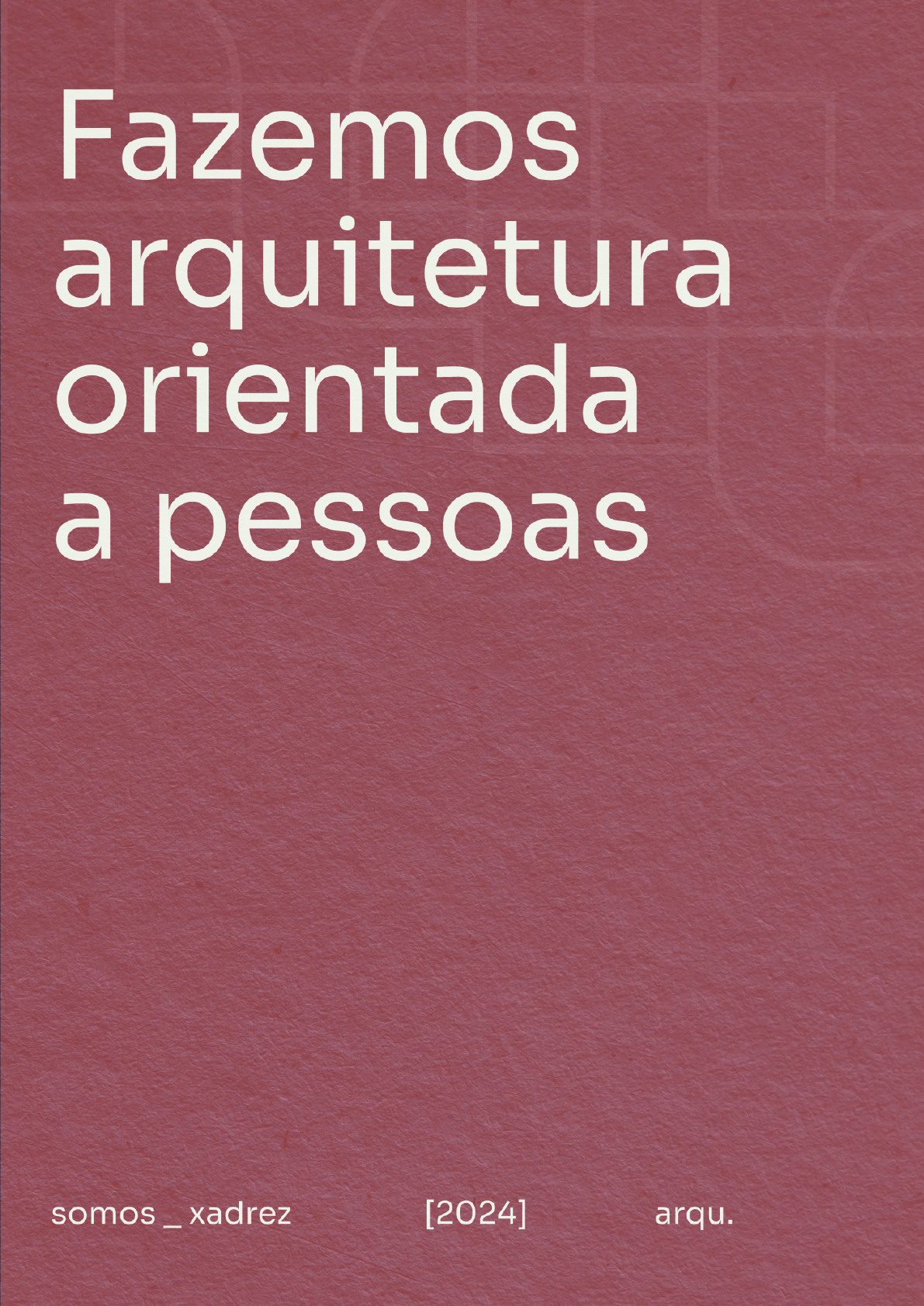
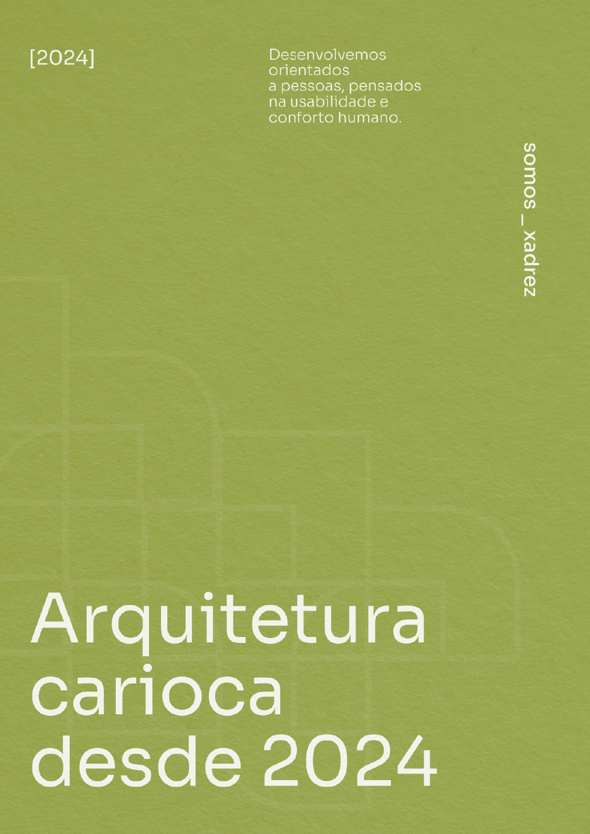
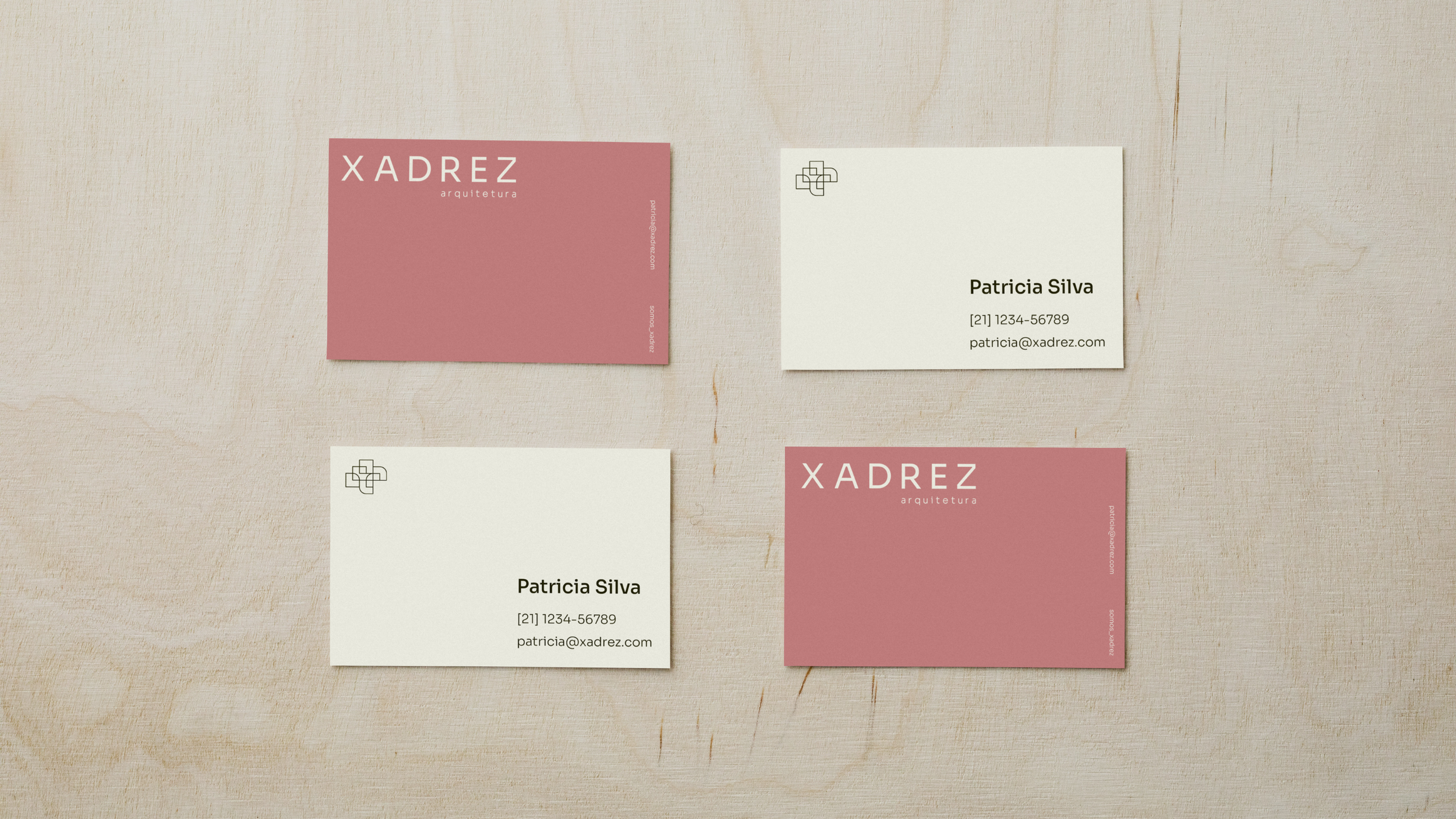
Visual identity for Xadrez Arquitetura, an architecture studio. Its founders, Luíza and Patrícia, wanted a brand that felt light and relaxed while still conveying precision and technical skill. The name carries personal meaning, since on the first project they worked on together they designed a checkerboard (xadrez) tiling that stayed with them.

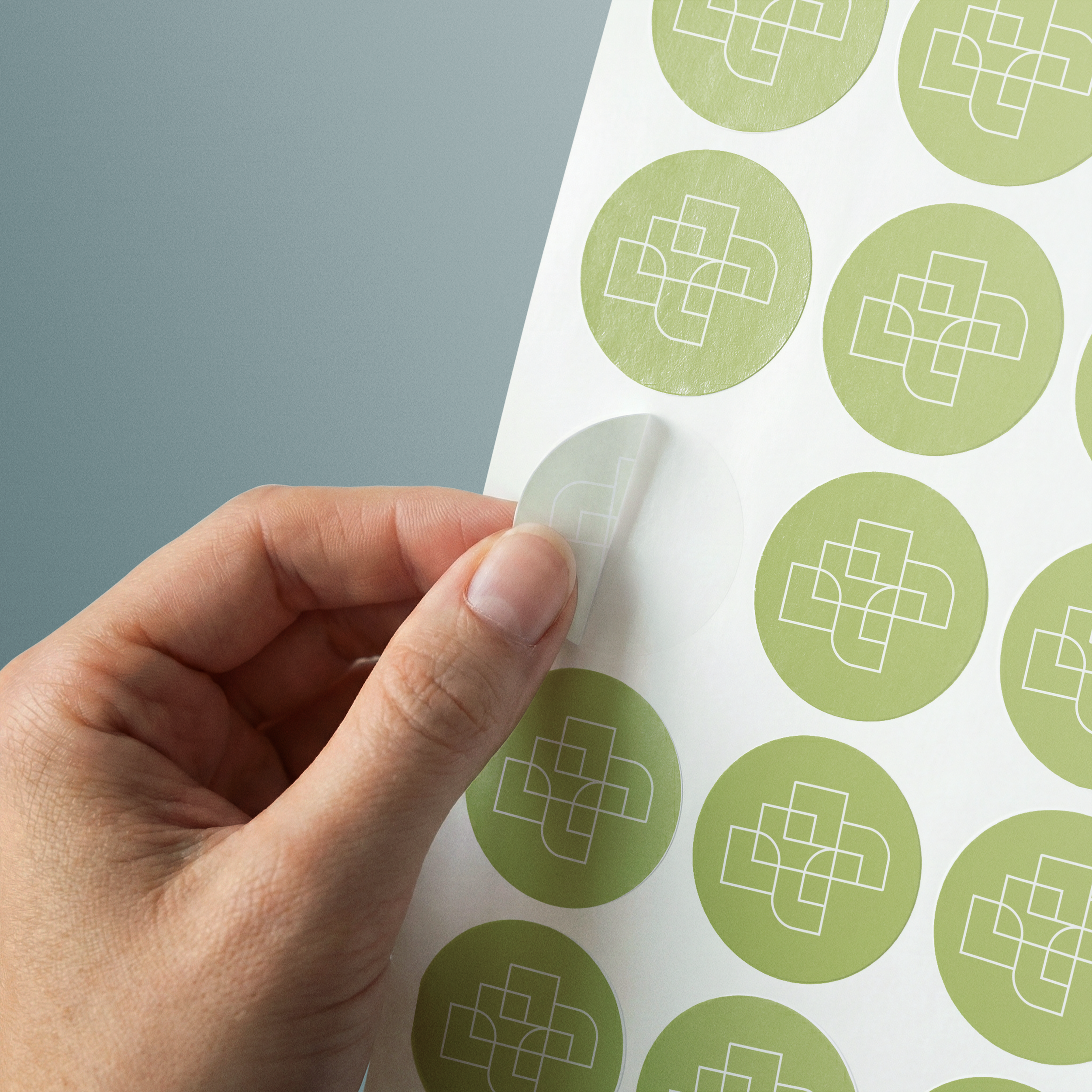
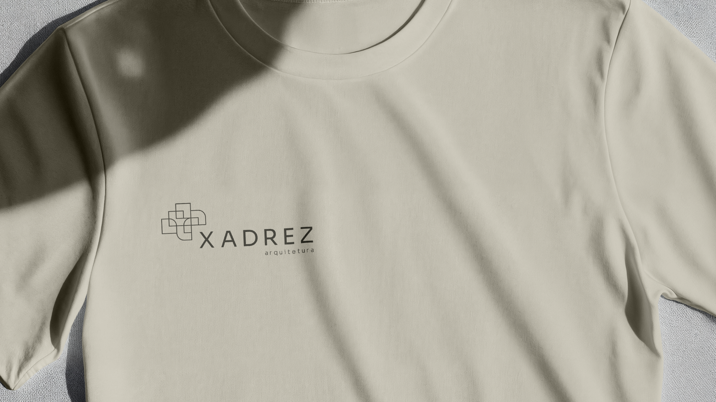
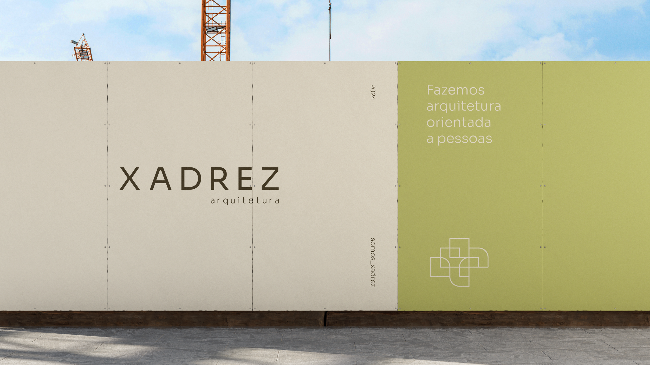
The symbol should evoke ‘chess’ without falling back on an obvious grid. Watching footage of chess championships, I noticed that players' arms trace an arc as they move the pieces across the board. That became the metaphor behind the project. An architect running a project works much like a chess player planning their moves, anticipating problems, reading the whole context and coordinating different pieces at once.
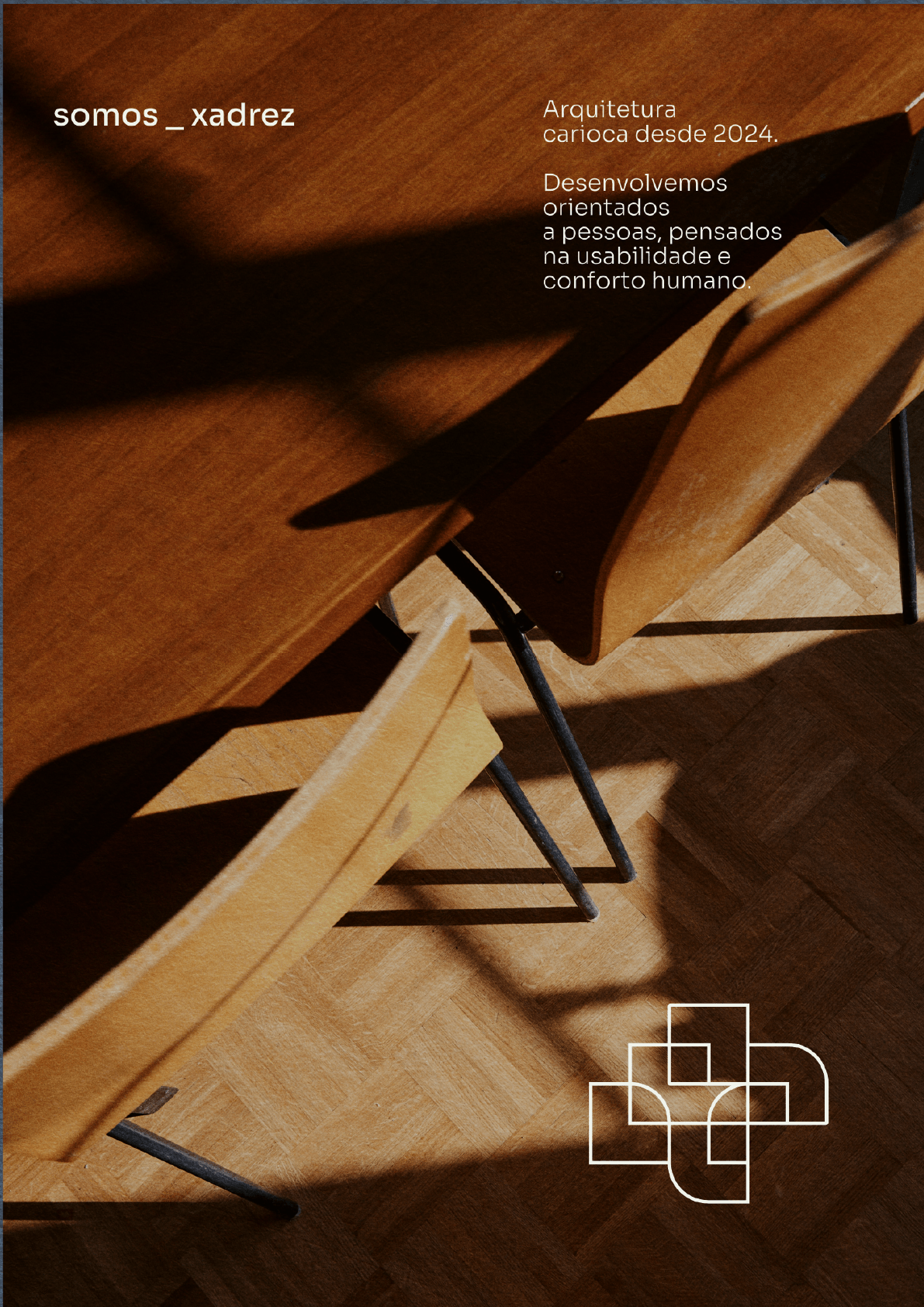
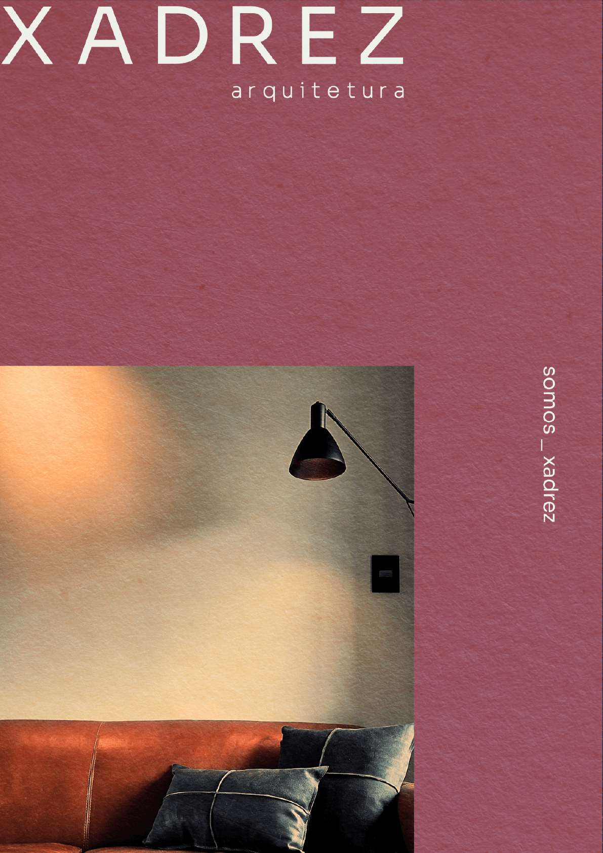
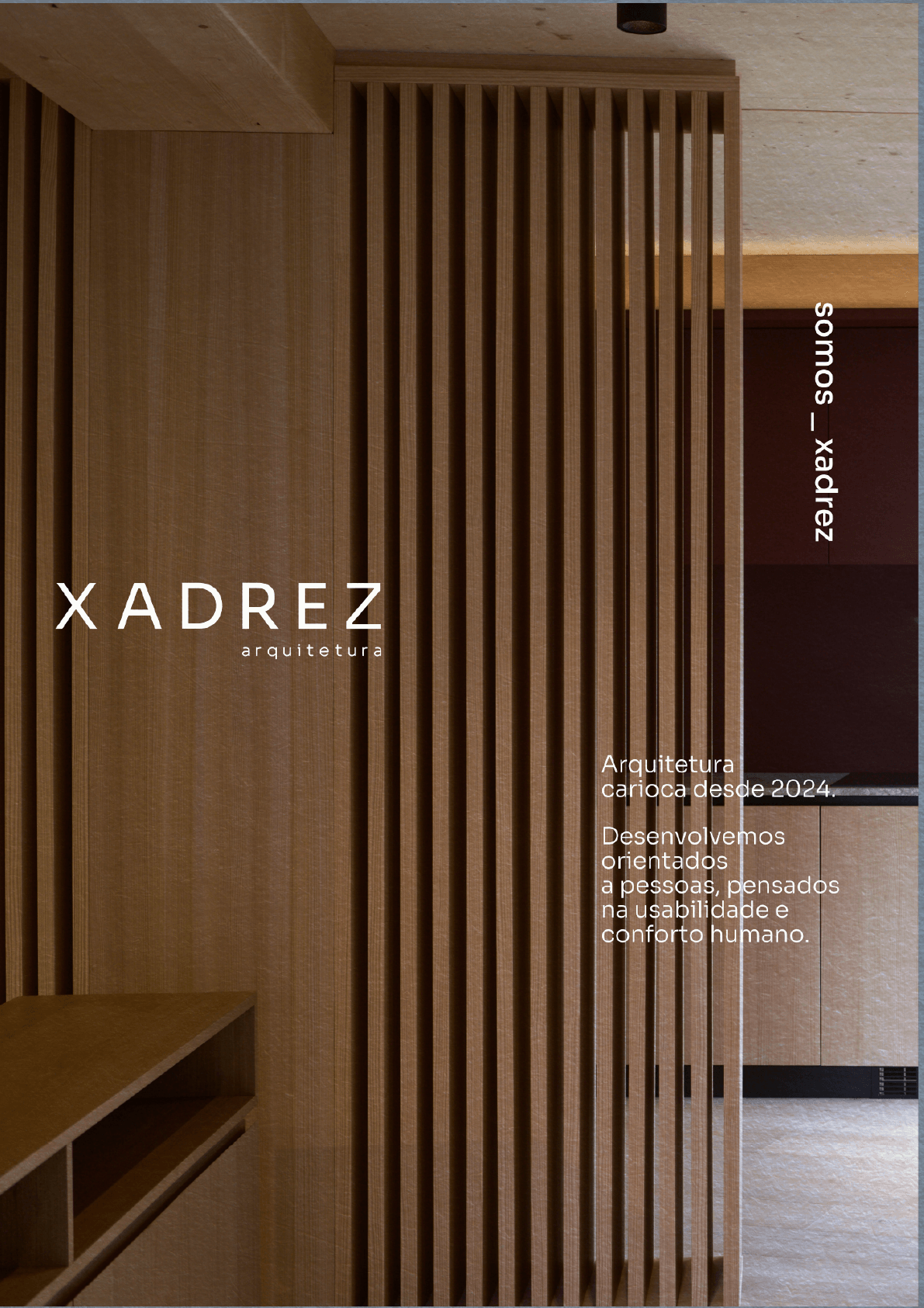
The symbol builds on the floor plan of the apartment where they created the checkerboard tiling, reworked into a mesh of arcs that represents the architect's movement and flexibility throughout a project. The color palette pairs lime green with guava pink to bring the lightness and joy the architects were after. These colours are uncommon in the field, but set against the geometry of the brand typeface (Sora), they keep the result professional.